Smart Interface Design Patterns
par user5032780 surname5032780 @permalink5032780
- 487
- 7
- 0


Smashing Magazine is the leading resource for people who want to learn about the latest web technologies.
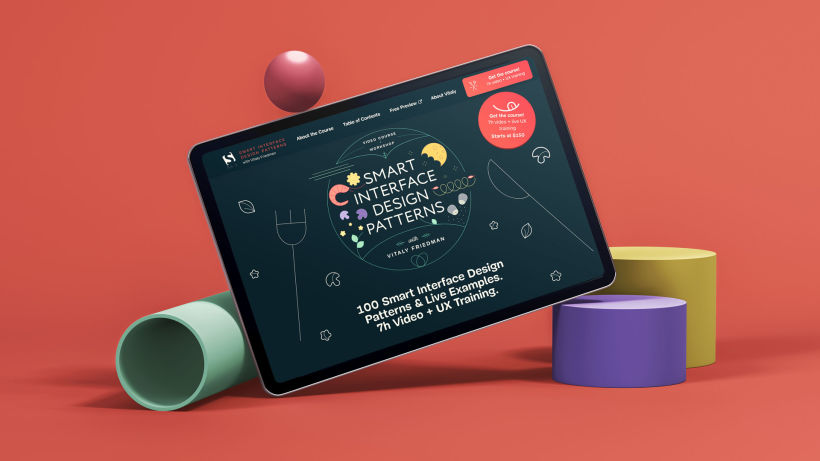
In the light of a previous collaboration (the design of Smashing Book 6), founder Vitaly Friedman asked me to join the launch of a prized project he had been working on for long time: the Smart Interface Design Patterns courses.
For the landing page design, Vitaly requested that the interface should feel like a part of the Smashing Magazine brand.
This meant that part of the UI (fonts, buttons and forms) already used on the leading platform would be seamlessly integrated into the course website.
I develop a beautiful story using the kitchen as a metaphor, as all of the videos had been recorded in a beautiful kitchen, and that each course opened with a handwritten title on a blackboard.
I kept the dark colour of the blackboard, on which the entire story takes place. Then I imagined each video as a ‘recipe’, packed with useful advice and examples (aka, ingredients!) knowledgeably presented by the master ‘web-chef’, Vitaly Friedman.
In light of this analogy, all of the landing page illustrations followed the same storyline.
Throughout the site, the illustrations refer to the world of gastronomy, while for a more consistent experience, the copy reflects the food theme.


0 commentaire
Connectez-vous ou inscrivez-vous gratuitement pour commenter